Pavel Žikovský
xzikovsk@hwlab.felk.cvut.cz
Computer Graphics Group
Faculty of Computer Science and Engineering
Czech Technical University
Prague / Czech republic
Contents:
Abstract
1. Introduction
1.1 Metaphors
1.2 Direct manipulation
1.3. Application vs. document oriented systems
1.4. Agents
1.5. Consistency
1.6. Interface Controls
2.New approach
2.1. Introduction
2.2 Initiate menu
2.3 Directory tree
3. Implementation
3.1 User manual
4. Conclusions and future plans
5. References
As time passed, the type of data the user interface should deal with has changed and amount of data has many times increased. This fact is well known, but we are still using old Macintosh WIMP (windows, icons, menus, pointer) model of user interface, and there is very little real innovation in interface design anymore. The goal of this paper is to present a set of ideas, which should take role in next millennium human interface, and present an innovative human - computer interface, based on 3D graphics.
Keywords: user interface, 3D, 3D GUI, OpenGL.
This paper is divided in two main parts. In the first part (chapter 2), main advantages and disadvantages of current UI are explored as well as solutions of insufficient ideas and properties. In second part (chapter 3), we present the new approach to this problem, including implementation and user manual. In following article the advantages and disadvantages of the WIMP computer-human interface design principles are examined. I have focused on the Macintosh interface here, because it is a prime example of the current interface scheme. These principles have not significantly changed since the introduction of the Macintosh; style guides for other popular graphical interfaces, such as Motif, OPEN LOOK and Windows list a very similar set of principles as the basis for their interfaces. I should state at the outset that I am devoted fan of the Macintosh human interface and frequent user of Macintosh computers. Purpose of this paper is not to argue that the Macintosh human interface guidelines are bad principles, but rather to explore alternative approaches to computer interfaces. The following articles will present basic principles used on today's computer-human interaction.
The first Macintosh principle states that the interface should be based on metaphors with the familiar non-computer world around us. In the Macintosh interface, computer files are represented as documents in paper folders that are placed on a desktop. Files are deleted by dragging them to the trashcan. Although the use of metaphor may ease learning for the computer novice, it can also cripple the interface with irrelevant limitations and blind the designer to new paradigms more appropriate for a computer-based application. As an example of the limitations of the desktop metaphor, consider the trash can on the Macintosh desktop. It is a fine metaphor for the wastebasket in an office. In both cases we dispose of objects by putting them in the trash can and we're able to retrieve documents we had thrown out until the trash is emptied. However, the limits of the single-trash-can metaphor has led to a system that fails to meet the user's needs and causes confusion by masking the realities of the implementation. In the underlying implementation, there are separate trash containers for each volume, such as a hard disk or a floppy disk, but to avoid the confusion of multiple trash cans in the interface, the contents of the trash containers for all mounted volumes are combined and shown as a single desktop trash can. Because there is only one trash can in the metaphor, if the user empties the trash to create room on a floppy disk, the trash contents on both the floppy and the hard disk are deleted, even though there was no need to delete files from the hard disk's trash can. The desktop metaphor assumes we save training time by taking advantage of the time that users have already invested in learning to operate the traditional office with its paper documents and filing cabinets. But the next generation of users will make their learning investments with computers, and it is counterproductive to give them interfaces based on awkward imitations of obsolete technologies. Instead, we need to develop new interface paradigms based on the structure of computer systems and the tasks users really have to perform, rather than paradigms that enshrine outmoded technology. The way to advance the interface is not to develop ever-more-faithful imitations of the desktop, but instead to escape the limitations of the desktop especially as computers themselves become ubiquitous and are used away from the desk.
Using direct manipulation, users interact directly with objects in the interface. The archetypal example is to move a file from one directory to another by opening the original folder and using the mouse pointer to drag the file icon to the destination folder. This procedure works well for simple actions with a small number of objects, but as the number of actions or objects increases, direct manipulation quickly becomes repetitive drudgery. The dark side of a direct manipulation interface is that you have to directly manipulate everything. Instead of an executive who gives high-level instructions, the user is reduced to an assembly line worker who must carry out the same task over and over.
The application model is directed to users who have integrated tasks that require multiple applications to solve. Approaches to alleviate this mismatch in the past have included integrated software and composite editors that could deal with multiple data types in a single document. No single program is likely to satisfy all computer users, however, no matter how tightly integrated it is, so other approaches have also been invented to break the application barrier. Cut-and-paste mechanisms have been available for several years to allow the inclusion of data from one application in a document belonging to another application. Recent systems even allow live links back to the original application such that changes in the original data can be reflected in the copy in the new document. However, these mechanisms are still constrained by the basic application model that requires each document to belong to a specific application at any given time. An alternative model is emerging in object-oriented operating systems where the basic object of interest is the user's document. Any given document can contain sub-objects of many different types, and the system will take care of activating the appropriate code to display, print, edit, or email these data types as required. The main difference is that the user no longer needs to think in terms of running applications, since the data knows how to integrate the available functionality in the system. In some sense, such an object-oriented system is the ultimate composite editor, but the difference compared to traditional, tightly integrated multi-media editors is that the system is open and allows plug-and-play addition of new or upgraded functionality as the user desires without changing the rest of the system. It is possible that the very notion of files and a file system is outdated and should be replaced with a generalized notion of an information space with interlinked information objects in a hypertext manner. As personal computers get gigabyte harddisks, and additional terabytes become available over the network, users will need to access hundreds of thousands or even millions of information objects. To cope with these masses of information, users will need to think of them in more flexible ways than simply as "files," and information retrieval facilities need to be made available on several different levels of granularity to allow users to find and manipulate associations between their data. Also, several commercial products are already available to add full-text search capabilities to existing file systems, but these utility programs are typically not integrated with the general file user interface.
Agents are autonomous processes in the computer that act on behalf of the user in some specified role. The eventual goal of some researchers is to have highly intelligent agents that know the user's schedule, can retrieve exactly the desired information at any given time, and in general combine the functions of butler and secretary. For example, a very effective demo of the conversational desktop system had the computer remind the user of a scheduled flight (possible through knowledge of the user's calendar), that traffic to the airport currently was heavy (possible through a link to the city's traffic computer), and offering to call a cab (possible through speech synthesis or a direct computer link to the taxi company). Agents can also be very simple. For example, an agent might count the number of times a user gives an invalid command and then offer the user an explanation when the count reaches a certain number. Even without the high level of artificial intelligence and the excessive requirements for standardization of information exchange needed to support some of the more fancy scenarios, agents can still help users with many tasks. For example, MS Outlook allows users to construct agents to sort and filter their incoming electronic mail according to various criteria. A typical agent could search for talk announcements and place them in a special mail folder from which they could be automatically deleted after the announced date of the talk unless the user had moved them to a permanent archive first.
Consistency is one of those principles that sounds like a great idea when you first come across it, but it is very difficult to apply the principle in any real situation where there is a wide array of conflicting things with which you can be consistent. The basic advantage of consistency is the hope that learning will be reduced if objects with a similar function always look and behave the same. People will recognize applications more easily if they all have similar icons. Yet in the real world, people have no difficulty switching between ballpoint pens and fibertip pens even though they look somewhat different and have different controls. They are similar enough that they are both recognized as pens, whereas their varying appearances provide pleasure and clues to their slightly different functionality. It is the rich and fine-grained representation of objects in the real world that allows pens or books to have a wide variety of appearances and still be easily recognizable. As representations of objects in the computer interface become richer and more fine-grained, the need for complete consistency will drop.
It follows from the above discussion of the changes in the user's and the computer's role in the interaction that much of the control of the user interfaces will pass from the user to the computer. Sometimes, the computer may even choose to perform actions without explicit user control, and often, it will customize the interaction by changing appropriate parameters automatically. Some users may resent computer control of the interface if it is not designed carefully. Many forms of adaptive interfaces may be readily accepted because they simply cause the computer to behave the way one would naturally expect it to do if it were part of traditional physical world. For example, the organization of kitchen tools in drawers and cabinets adapts by itself to cause the most frequently used tools to be on top and in front, whereas less frequently used tools are hidden. In a similar manner, several current applications augment their "File" menu with lists of the last five or so files used by the user in that application, under the assumption that recently used files are likely to be among the more frequently used ones in the future and thus should be made more easily accessible. More about user interfaces in [1] and [4].
The main principle of this project is to represent tree structure into 3D space in a way, which should be as lucid and compact as possible. The second thing we have to care about is moving inside the tree. Because we are here handling with n-ary trees, there is no way to deal with this movement in 3D space. So, this can be untwisted by more-dimensional spaces or by a sequence of more independent 3D spaces. Because human orientation in space, which has more dimensions than three is quite problematic, the second possibility looks like the right one. After a deep contemplation I resolved this by representing the tree structure as system of pipes, which chassis consists again of pipes. (See fig. 3.).
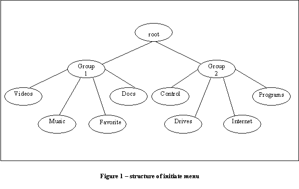
Because in the last few years computer becomes more a multimedial console than a simple machine, classical division of informational space becomes little bit non-intuitive. Due this fact I've designed a typology of files. Files are divided into two main groups - mostly due to directness of use. In first group there are four items:
Second group, which is more a "dead ringer" or residuent for nowadays user interface. Note, that due to this project aims more to document oriented model (see 1.3.), there is no primary need for running standalone programs as well as accessing physical drives' structure. Also, the "Controls" should be redundant - the computer itself should take care of it's settings (more P n' P). The only reserve is the "Internet" node, which should take care of special Internet services. Usual web pages will be found under "documents" node in previous group. Anyway, the contents of this group is:
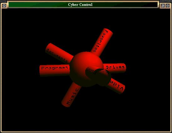
This typology is implemented also in 3D, and this is done by pipes connected to sphere, where first group circles around the z-axe (and therefore all items are visible at the time) and second one around y-axe (some items are hidden for a moment). (See fig. 2.) 3D realization of this structure seems quite appropriate according to it is usability and consistency. This file-type classification covers whole spectrum of commonly used files and keeps users away of physical data representation, by which they are bothered when using common file managers like MS Explorer of Norton Commander.
As we have already said, the directory structure is represented by a pipe, which chassis is made again of pipes - they represent other directories or files. In case of directory the user enters the pipe, which chassis is made of other pipes representing other files of directories and so on.
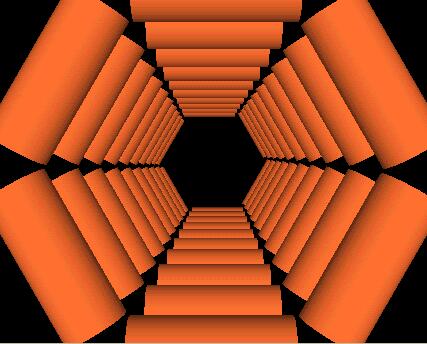
It's clear, like in other visualization systems, (and due to hardware boundary) that only a part of visualized data can be visible. User can access another items (which are too small for reading) by moving through virtual space (in direction of z-axe) upwards or backwards. In individual leafs of "fan" files are for better orientation ordered according alphabet, namely that way, that on the first leaf there are files young on letter "a" till "d", in second "e" till "h" etc. As is from picture evident, informatory density of this kind of display is generally 6 x higher, than cut-and-dry 2D attitude. In addition, order set can remain statical, sequenced according to alphabet, or this order can be organized itself, dynamically, according to frequency of nodes usage. (As already written in 1.4.)
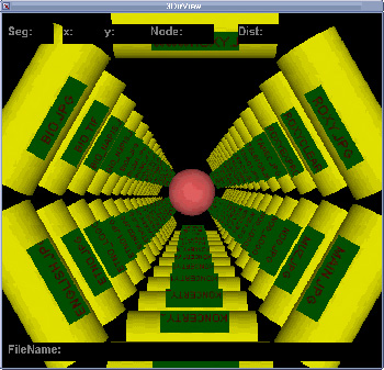
Program has been implemented in Borland Delphi 3, using standard OpenGL libraries (gl.pas and glu.pas). Smaller problem is however the speed of then system, for on Pentium 120 MHz, depiction of standard directory (100 files) takes approx. 20 seconds, which keeps on being too much. By using faster processor (which is not a problem nowadays) and OpenGL accelerated graphic card, the system becomes quite fast and usable (tested). Because of the speed of used system, file names are not displayed as 3D text (what was the original idea), but only like small textures. Also, the movement through the space isn't smoothly animated, but degraded only to moving by steps. Note, that fig. 4 shows only "development version", which is in some ways crippled to increase the interface speed.
The only one parameter required running the program is a name of directory, which we want to display. After displaying the directory user can move through space in advance resp. backward by key "up" resp. "down". By simple double-clicking required file this file starts with it is associated application.
It seems, that alternative, and mainly 3D user interfaces are the future of GUI standards. This is mainly due to it is informatory density and ease of use. In near future we can expect semi-intelligent 3D user interfaces, with richly developed agents and complexity of use. There are already tendencies to set up such a standard (see [3]) and to overcome today's' WIMP standard. This project aims to be a first step in realization of such a thoughts. As future work, all mentioned principles should be implemented (which hasn't been done due to hardware requirements). Also, there should be an implementation using 3D sound, which will help blind people to navigate through 3D space. For these people, there will be also a text-to-speech and voice-recognition module available.